Resy

Speculative Work ​​​​​​​

About Resy

Resy, established in 2014,  is an online booking service for restaurant reservations, both on their mobile app or via computer. Diners around the world rely on Resy for access to the most exciting restaurants.

Project Overview

The design process for expanding Resy’s 
social network

Project Info

Duration: 3 weeks
Timeline: July 17, 2023- August 1, 2023
Role: Project Manager and designer

The Problem

The restaurant industry took a big hit due to the pandemic closing down dining venues and as a result, fine dining experiences have struggled to go back to the way they used to be. Resy was interested in implementing new features to help drive revenue and expand their network to stay ahead of competitors while also increasing their booking numbers. Meanwhile, users were struggling to find places to eat with trustworthy reviews and at an affordable cost.

The Solution

Create a flow for users to be able to book seamlessly at venues they trust while creating social buzz for the restaurants they dine at. Thus, increasing user engagement and increasing restaurant bookings.

UX Methods And Design Tools Used

Research | Interviews | Affinity Mapping | C&C Analysis | Personas | Journey Map | User flow | Service Blueprint | Storyboard | Wire Framing Prototyping | User Testing | Iterative Design | Task Analysis​​​​​​​

My Role

As one of the UX designers on the team, I served as the project manager, outlining the tasks each team member needed to complete and setting deadlines for each deliverable. In addition, I assisted in the user interface for the project.

The Results

The Resy app redesign and feature implementation increased the overall usability and satisfaction of the app. Our Resy social network, the ‘friends feed’, provides users with honest ratings and suggestions on where to dine based on their friends experiences, thus improving customer engagement. With this feature also came a rewards system that encourages customers to post about where thy ate and by booking through that channel gives discounts and special offers to their friends. 

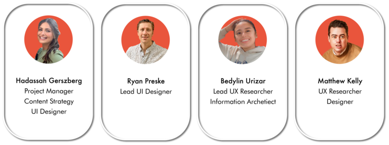
The Team​​​​​​​

The Process

Discover

The first step of the design process, involved understanding the company and their goals. Primary research such as competitor analysis and user interviews was conducted. 

Define

After analyzing these insights and synthesizing our findings, we began to define the problem, focusing on user flows, personas, journey maps, site maps, and How Might We (HMW) statements.

Design

Moving into the development of the site, we  began sketching low-fidelity iterations of the interface. From there we were able to design Mid- fidelity grayscale wireframes, taking into account research-based feature prioritizations and key design principles such as brand attributes, hierarchy, and user feedback. 

Deliver

Once the interface was ready, we began testing, analyzing and iterating the designs. we received feedback from users and other fellow designers in order to better the experience.

Competitive Analysis

We identified 2 direct competitors and 2 comparable companies who are all large, well-established online booking services for restaurants and other media. We evaluated each brands mobile app based on how its site navigation, its features, their reviews and booking process.

User Interviews | Key Insights

Reviews | 87% of users rely more on their friends recommendations than random online reviews “I only take suggestions from trusted sources like friends”
Online| 75% of users prefer making reservations online | “Booking online takes minimal buttons”
Payment | 87% users want some form of discount by payment without waiting for the server | “I would use apps with more incentives”
Meet The User

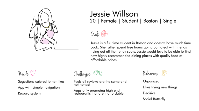
User Persona

Jessie's Problem

Jessie needs a way to pick new restaurants that have been approved through her social network so that she can try new places that she trusts will be good.

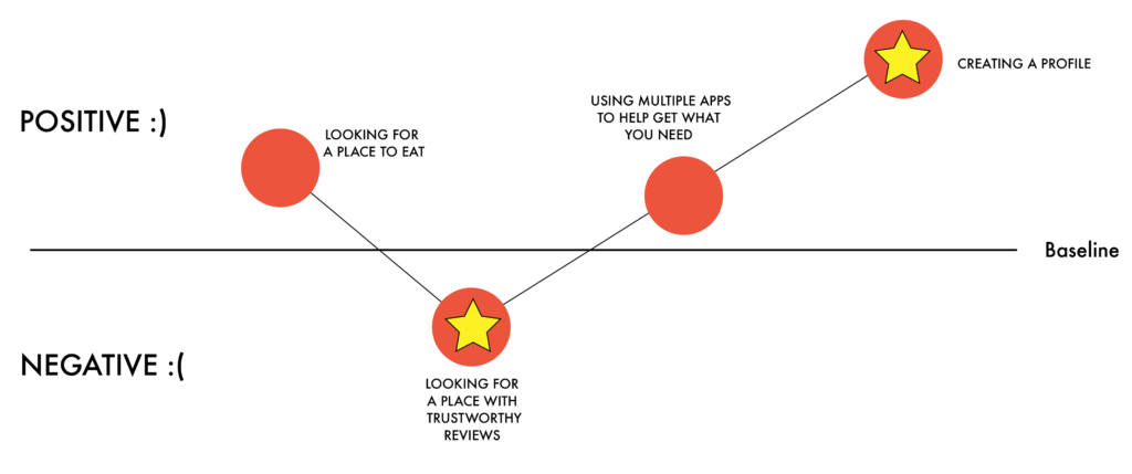
Jessie's Journey Map

To better understand the users highs and lows while making a reservation, we created a journey app. This map highlights how jessie felt while looking for a restaurant within the Resy app. A negative emotion that jessie experienced was during the consideration aspect of looking for a restaurant with good reviews. This is one examples of where we saw opportunity.
User flows

1. Jessie booking through her friends feed

2. Jessie paying through the Resy app

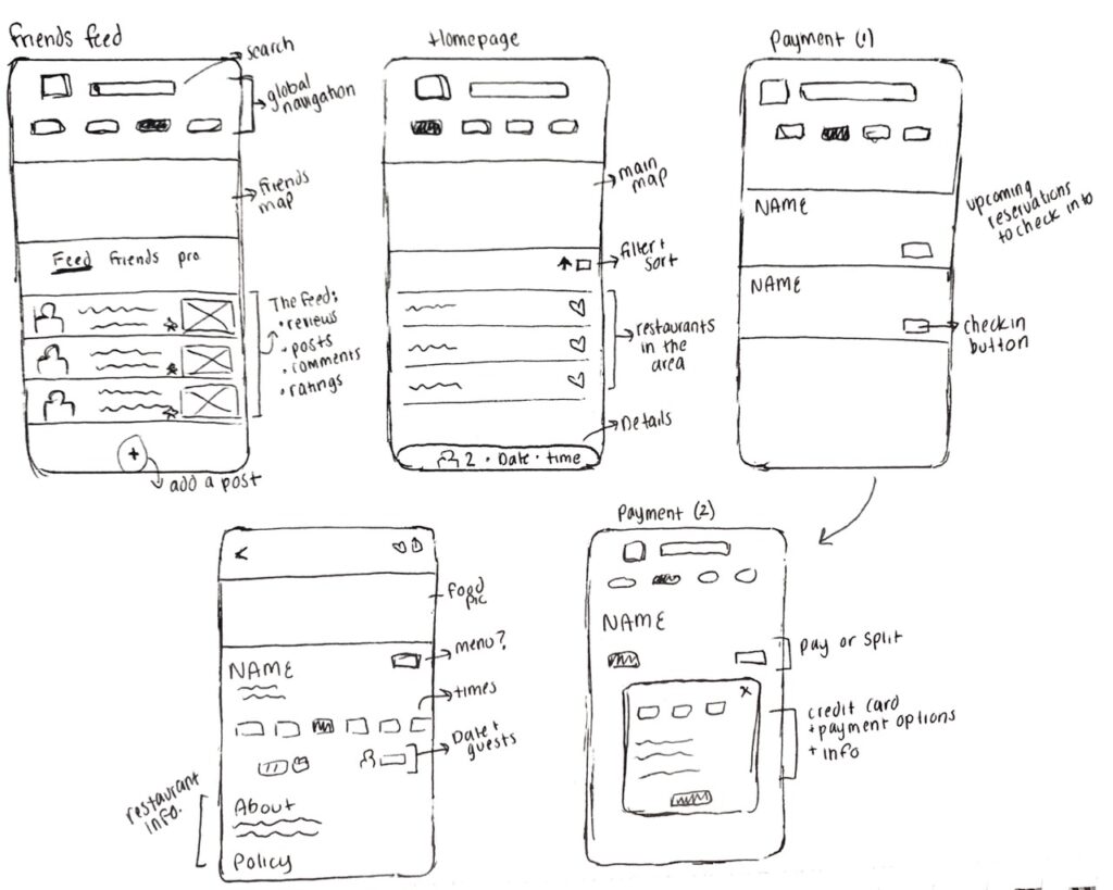
As we moved into our design phase we started with rough sketches. This helped us get a better understanding of how we envisioned the new features that were implementing and the changes we wanted to make. Above are some of these sketches.

The Solution

Usability Testing

Through rounds of testing our mid-fidelity wireframe and redesigning through ideations we ended up with great results for the final prototype. We conduced10 usability tests in total, followed by short follow up interviews to better understand our users thoughts on the product.

<1 minute | 0 Errors

After ideations users took less than a minute to complete the given tasks and the errors went from 3 to 0 making the final prototype a success.

Booking through the 'Friends Feed'

When booking through the ‘friends feed’ you are given a 10% off friends discount code. This way people are motivated to post about where they have eaten and take recommendations through this channel. You also see in this walk through how you can alert the restaurant of any special requests or dietary restrictions.

Paying for your meal through the Resy app

Within the reservations tab you will see you upcoming and current reservations. Once the user is checked by the restaurant their app is updated for them to people to pay for that meal at any point.
 
Next Steps

More Features

We would love to be able to further develop Resy’s app by integrating more features that users felt were needed. Diners liked the option to be able to view the menu on the app before booking and have additional filtering available to them as well when picking a restaurant. 

The Business

We would love to be able to conduct more interviews with restaurant owners to gain more information on the business end rather than just the consumers point of view.

My Learnings

1. Navigation
Navigation is crucial to have in any app or website because it can directly affect sales. A well-designed navigation system can make all the difference in how users perceive and app, find products, and complete a task. Updating Resy’s Global navigation, which was one of our biggest design iterations, made all the difference for our users.
 
2. Communication
While I do have experience working within teams, this was my first time working with UX designers, which brought on its own set of challenges. I had to learn to be more open to constructive critique, as well as learn how to adapt to other designers’ methods, yet above all communication was key. One of the reasons I feel like my team was successful was due to the way we spoke to one another and conducted ourselves throughout each meeting. We were encouraging, honest, and growth oriented. This project has allowed me to develop new collaboration and communications skills that will be help me for projects in the future.
 
3. Project Management
Taking on the role of project manager for the first time was definitely daunting. At the start of the project, I felt uncertain and overwhelmed, not so much by my responsibilities, but on how I would manage my team. However, I quickly realized that my organizational skills and empathetic nature would guide me. I always made sure to speak in a way where I was an equal and listened to everyones comments and concerns. I learned how to balance “being in charge” without being bossy. This is management skill is something I know will help me in future projects.