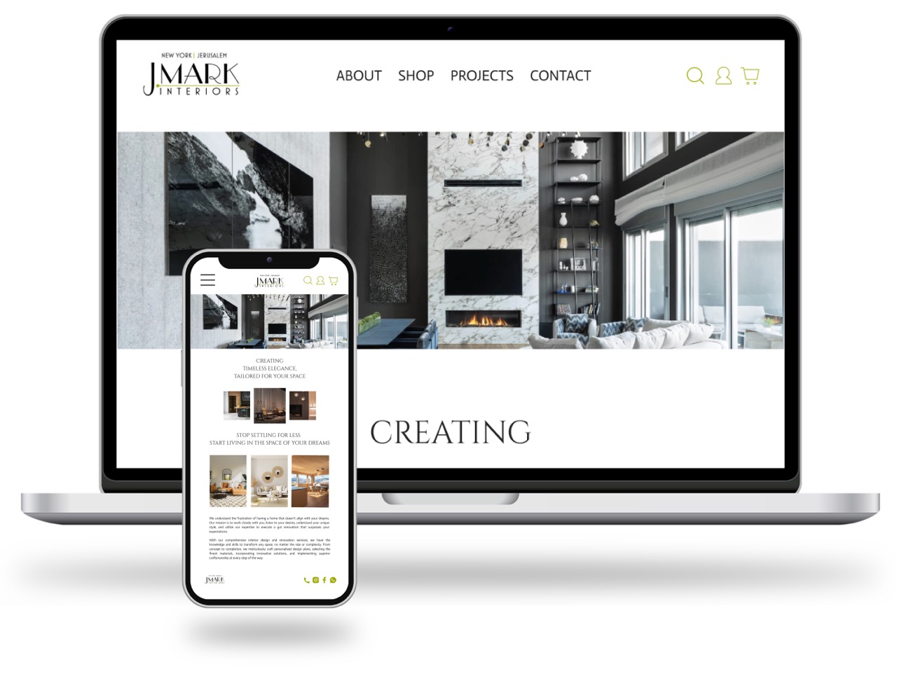
Outlined here is my design process, carefully curated to revamp the website of this high end interior design company and revive its online presence.


Research | Interviews | Affinity Mapping | Card Sorting | C&C Analysis | Personas | Wire Framing | Prototyping | User Testing | Ideations

As the sole UX designer on this project, my role encompassed all aspects of the redesign process, from research and analysis to design and testing. This required me to be highly self-motivated, organized, and capable of working independently.
An Interactive High-Fidelity Prototype which incorporates a redesign of the information architecture, enhanced navigation, and an aesthetically pleasing design. The new design was achieved by carefully implementing UI foundations, including their original modern color scheme, typography, and updated imagery that aligns with The J.Mark brand guide.
The first step of the design process, involved understanding the company and their goals. Primary research such as competitor analysis and user interviews was conducted. Secondary research entailed card sorting and synthesizing the data
After analyzing these insights, I began to and define the problem, focusing on user flows, personas, and How Might We (HMW) statements.
Moving into the development of the site, I began sketching low-fidelity iterations of the interface. From there I was able to design Mid- fidelity grayscale wireframes, taking into account research-based feature prioritizations and key design principles such as brand attributes, hierarchy, and user feedback.
Once the interface was ready, I began testing, analyzing and iterating the designs. I received feedback from users and other fellow designers in order to better the experience.
I identified 2 direct competitors and 2 comparable companies who are all large, well-established online retailers of home decor and other media. I evaluated each brands e-commerce site based on how it functions, its features, their product quality and customer service.

6 participants | Ages 22-52
To further aid the development of J.mark’s site and fill in the gaps, I aimed to gain a more comprehensive understanding of the target users, including their motivations, goals, and pain points. To achieve this, I conducted 6 user interviews and asked questions to familiarize myself with how they usually checkout on similar sites and understand their overall relation with online shopping.
Guidance | users seek help with product purchase | “I have specific questions about items and there is no one to ask”
Simplicity | users prefer an easy navigation and a fast check out process | “I like when checkout has my information so its faster”
Trends | users want to be kept in the ‘interior design know’ | “I like seeing what items are trending”

Lucas needs an easy way to buy his home decor with guidance so that he feels confident in his purchases.


Creating rough sketches allowed me to quickly visualize my ideas and explore different possibilities without getting distracted by details. it’s a great method to help identify potential issues and make improvements early on in the design process, which can save time and resources in the long run.
Shown below is a basic flow of the screens jumping around from main tabs into purchasing an item.

J.Mark’s site didn’t just lack the e-commerce function. Customers were also unable to browse the products they sold in their stores. When building out the shopping feature I added a functional system that allows users to scroll through and discover all the home decor in any category, improving the overall user experience.
Demonstrated on your left is the seamless task of purchasing a chair. Key features in this flow include the ability to see what pairs well with your selected item, buy your product right away, the ability to connect with someone for questions and having the users information saved at checkout.
1. Features
The initial redesign was focused on building out the basic necessitates for a functional e-commerce site with some additional new features. However, based on the feedback from our first round of user interviews there were other unique components to provide the consumers with and set J.Mark further apart from their competitors. I would take more time to develop the site and implement features like ‘view in your room’, allowing customers to be able to use their camera to show what the decor what would like in their desired location live.
2. Feedback
After launching the redesigned e-commerce website, it’s essential to gather feedback from users to understand how they are interacting with the site and what improvements could be made. I would conduct another round of usability tests, send out surveys and monitor website analytics to track metrics like time on page or the bounce rate to collect feedback and analyze the results to identify areas for improvement.
3. Pitch the redesign to J.Mark Interiors
As this was a speculative project, the next step could be to pitch the redesigned e-commerce website to J.mark and demonstrate how it could benefit their business. This could involve presenting the research and data that informed the redesign, highlighting the improved user experience and potential increase in sales, and addressing any questions they may have.